The swoosh and the squiggle: Is there a logic to logos?
Pepsi’s recent announcement of its new logo has put the spotlight on brand logos, those ubiquitous symbols that often convey much more about a brand than any textual description could.The redesign of Pepsi’s logo makes us wonder whether the design of the logo matters all that much. Put simply, if Nike had sported a squiggle instead of the iconic swoosh, would that still make us just do it and buy our Nikes?
Of course, it is easy to argue that the design matters. But, toss in a bit of psychology to the discussion and it becomes clear that the brand is much more than its logo. After all, the Nike swoosh is now wired into our brains not so much as a shape but in terms of the meanings and memories that the shape evokes. And that could explain why successful brands can have logos as intricate as that of WaghBakri or as simple as that of SBI.
To word or not to word
Prior to its redesign, the Pepsi brand name was placed outside the circular logo. Segregating the brand name and the logo is not in itself a big problem. Brands such as RedBull and Puma follow this pattern.For Pepsi, however, this design was not working well as the brand found out, when consumers were asked to draw the Pepsi logo from memory, and tended to recall the brand name as being placed inside the logo. And so, the Pepsi brand name sits smack in the centre of the new logo. In direct contrast to Starbucks, which took away the words surrounding the siren in the centre.
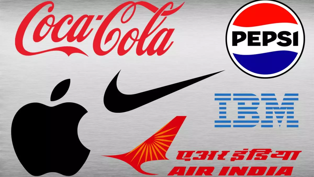
Of course, there are brands such as Nike and Apple for which just an image of the logo is sufficient to make consumers think of the brand. But Pepsi cannot do that. At the other extreme, there are brands whose logo is simply the brand name written in a stylized font. Coca-cola and IBM, for instance, use stylised writing and colour without a shape. Perhaps, having little material to play with has a role in keeping the Coca-Cola logo stable over the years.
A game of colour
It might be hard to believe today, but Apple once had a very colourful logo – the same shape of the apple with a bite taken off, but with rainbow colors. Today such a logo would be surmised as related to supporting LGBTQ+ rights. After all, several brands change their logo to rainbow colours during LGBT pride month, so much so that this gesture could lose its value. But the white logo of Apple is so omnipresent that the absence of colour glorifies the brand.
Does that mean all brands that seek to be perceived as premium need to go white? Not necessarily. Other colours can become iconic just as well, be it Coca-Cola red, Starbucks green, or Tiffany blue. And while the jury is out on which colours can really set a brand apart, Apple has once again upped the game with a highly colourful art-based logo on its Apple BKC store in Mumbai. Well, if Apple has decided to colour itself for India, maybe it’s time to rethink the plain = premium theory!
Controversy, copyright and more
Refreshing a logo is always dicey business. Even when a business school goes about redesigning its logo, as in the recent case of the Indian Institute of Management Ahmedabad logo makeover, various stakeholders held differing views on the new logo. A few years ago, apparel brand Gap decided to revert to the old logo after tremendous uproar from customers. Not surprisingly, customers have a natural tendency to feel possessive of logos, as many logos are worn on the body and many others are placed on containers for food and drink.
Other issues surround logos due to their shape. Adidas’s three stripes seemed distinctive enough though it was unsuccessful in its trademark infringement appeal cases when it spotted other similar designs. Twitter changed its logo, somewhat inexplicably, to a dog, but has reversed the change (possibly to avoid having to rename itself Bark). Toblerone is up for a redesign of its logo because the iconic Matterhorn mountain can no longer be shown after Toblerone shifted part of its production away from Switzerland. Only time will tell whether the new logo can win the hearts of chocolate lovers.
Overall, redesigning a logo entails some risks, mainly because very few general rules exist, and consumer sentiment can throw up surprises. There are perhaps only two “truths” when it comes to successful brand logos, and neither has to do with the design of the logo per se. First, what the marketing department builds on top of the logo through follow-on marketing campaigns will, over time, build the equity associated with the brand logo. Be it Pepsi or Air India’s new look that is expected to be unveiled soon. Second, a logo of a well-known and loved brand is like the face of a loved one – familiarity and love overpowers looks.
And so, surprisingly enough, a squiggle on your Nike shoes – if marketed appropriately from day one – would have worked just as well as a swoosh!
(The writer is an Assistant Professor at IIM Kozhikode)


Leave a Comment